Case study: Portfolio site
A personal portfolio Bootstrap project
Launch a responsive website to showcase a portfolio
Approx. 8 weeks part time with occassional updates after
Solo project as part of a personal development goal
VScode, Bootstrap, Figma, Notion
01 | Overview
Project background
This case study describes my personal project to build a portfolio site using Bootstrap. Initially, I had a basic understanding of Bootstrap and its role in building responsive websites. However, delving into the project allowed me to gain a deeper understanding of Bootstrap's capabilities.
As a UX designer, I recognised the significance of grid systems, so I decided to embark on a Bootstrap learning journey. This case study illustrates my utilisation of Bootstrap's grid and navigation to establish the site's structure. Additionally, I discuss the integration of CSS and JavaScript to enhance functionality and visual appeal.

The goal
I needed a way to showcase my UX and UI projects professionally. I had already learned some CSS & HTML in the past, but I was rusty and Bootstrap was a mystery. I jumped at the opportunity to refresh some forgotten skills, learn something new and challenge myself to get a portfolio site up and running. Let's go!
Tooling decision
I chose Bootstrap for the following reasons:.
- Open source: No licences or payments are required to use Bootstrap, so it's got a huge community of developers. Perhaps that's why it's so widely used. Over 3.5 million websites use Bootstrap, and it's used by 11% of the top 100,000 websites, including PayPal, Etsy and Netflix.
- Resources and components: From buttons to navigation bars, accordions to carousels, there are lots of reusable elements available. This saves time!
- Responsive grid system: When the screen size changes, content in a Bootstrap layout can reposition into a different number of columns. For example, on a mobile screen, contact can flow down instead of horizontally. This is a straightforward way to create a responsive site and often bypasses the need to manually add media queries in CSS.

The process
I made a plan to streamline the process and I borrowed some UX methodology. In UX, we start with low-fidelity and ramp up the fidelity at various intervals to arrive at the final prototype. The approach I used for this web development project was similar. I would start with rough sketches and simple wireframes, create a basic template, and then add the visual design and finer details. Here's an overview of my plan.
Planning stage
- Create a site map
- Sketch the format
- Curate the content
- Make basic wireframes
- Review code, read and practice
Developing stage
- Write the code
- Apply the design
- Add interactive extras
- Debug and check for errors and compliance
Launching stage
- Obtain domain name and hosting
- Launch site
- Debug live site
- Optimize for SEO
02 | Planning
Setting up the files
Before jumping into any code, I needed to organize my ideas, content and vision for presentation first.
1. Create a site map
Although the site is a small portfolio site with only a few pages at the start, I still made a site map for reference and to plan the main navigation.

2. Sketching
The template for the case study is more complicated than the others, so I drew some possibilities for the format first. I also jotted down ideas for components that I would need.
3. Create wireframes
Although Bootstrap 5 can support up to six breakpoints, I focused on three: mobile, tablet and desktop screens. Using Figma, I made some basic block-style wireframes with dimensions that matched the Bootstrap breakpoints and displayed the column layout.

4. Curate the content
I needed to have the text and other content ready to put directly into the code (once I had some code!). My original plan was to organize and edit the project content in either Figma or Adobe XD, but I found this approach too fiddly when working with text. I switched to Notion because it's more suitable for editing and rearranging paragraphs of information.
I was able to replicate the wireframe structure in Notion with ease. Full width page view in Notion resembled a desktop screen size and facilitated planning as it allowed me to see text and deliverables side by side.
5. Review, read and practice
I needed to refresh my knowledge of CSS and start to figure out how to implement Bootstrap. The following tools helped me:
CareerFoundry
As a UX student at CareerFoundry, I was able to gain read-only access to some of the web development course.
VSCode
I installed VSCode and worked through the tutorials. I also added Github and connected it to VSCode.
Bootstrap documentation
I read through the Bootstrap documentation and played around with that in VSCode to understand it more deeply.
StackOverflow
I found myself here whenever I got lost and found the answers to my burning questions.
Codepen
Lots of snippets of code to view, tweak, test and save. JSFiddle is also useful for this.
Quiver
I saved all my important code snippets in Quiver so that I could find them and reuse them at any time.
Grids are the invisible glue that holds a design together.
03 | Develop
Building grids
I started with Bootstrap's starter template, which is just a few lines in the head section to create a functional - but completely blank - page. Then I could start building my own layout using the building blocks of Bootstrap: containers, rows and columns.
Similar to a traditional HTML table, containers hold rows and each row has a number of columns. Bootstrap uses a twelve-column grid, and the col class describes how many template columns to span. Each of these can have a breakpoint assigned, too.
In the diagram below, you can see that 4 columns gets pretty crowded on a small screen. This depends on the content, but it's likely that a multi-column layout switches to one column on mobile.

Columns 1, 2 and 4
Here is an example of these .col classes in action, which showcase a group of responsive 'stat boxes' to highlight important project information. I utilised the Bootstrap grid system to achieve this effect:
- On larger screens (lg), each row contains four columns
row-cols-lg-4in a horizontal row. - On the smallest screens, each row displays one column
row-cols-1, which stacks the boxes ensuring optimal readability and usability."
<!-- Stat box container -->
<div class="container px-4 px-md-2 px-lg-5">
    <div class="row gx-5
    row-cols-1 row-cols-sm-2 row-cols-lg-4
    py-4 text-center">
        <div class="col mb-3 mb-sm-0">
            <div class="p-2">
                <p class="fs-3 fs-sm-2 fw-bolder mb-0">21</p>
                <h5 class="text-muted mb-2">Surveys</h5>
            </div>
        </div>

        <div class="col mb-3 mb-sm-0 ...">

        <!-- Repeat 3 more stat boxes and close container -->
Changing direction
Now I needed a more complicated card arrangement. I wanted to place the title next to the icon on small screens and below it on bigger screens. The Bootstrap utility classes made this super straightforward. These are like a kind of CSS shorthand that condense the padding, margin and many other properties.
On line 5 of the code, the class flex-row arranges the
child divs in a row on the smallest screen. The following class flex-lg-column stacks the divs into one column on large
screens and above.
In line 6 of the code, I applied a lot of padding adjustments to make everything in the layout neat and provide some white space.
<!-- Set up container and row -->
<div class="col-lg-4 d-flex">
    <div class="card my-2 shadow border-0 flex-fill">
        <div class="card-body mx-2">
            <div class="d-flex align-items-center flex-row flex-lg-column">
                <div class="pe-3 pe-lg-0 pb-2 pt-lg-3 pt-2">
                    <img src="img/placeholder/icon.jpg" width="40" height="40" alt="icon" />
                 </div>
                <div class="py-2 ">
                    <h4 class="fw-bold text-lg-center">Title</h4>
                </div>
            </div>
            <div class="text-start text-lg-center ">
                <p class="mb-1 mb-lg-3">Short paragraph to describe the concept. </p>
            </div>
        </div>
    </div>
</div>
<!-- Repeat 2 more cols, add more rows or close container -->
Hiding and switching content
I needed a way to present processes and flows that show a sequence with arrows. A problem cropped up. Arrows that connect content from right to left don't make sense on mobile screens with stacked content moving from the top to bottom. My idea was to replace the arrow direction at a breakpoint.
I found the method with more handy Bootstrap utility classes: d-none and d-block which
respectively hide an element or make it visible.
This way, I could set up two divs, with a different arrow in each one. The right arrow appears on large screens, and the down arrow appears on smaller screens.
<!-- Set up container, row and col-->
<div class="col-md-2 my-auto text-start text-md-center">
    <div class="d-block d-md-none">
        <img src="img/icons/arrow-down.svg" width="60" height="60" class="img-fluid"
            alt="down arrow">
    </div>
    <div class="d-none d-md-block">
        <img src="img/icons/arrow-right.svg" width="60" height="60" class="img-fluid"
            alt="right arrow">
    </div>
</div>
<!-- Repeat cols, add more rows or close container -->
04 | Enhance
Styling the grid
By this point, I had the basic HTML file for a case study template that was a pretty close match to my wireframes. It was time to enhance by adding some styling.
Colour mapping with SCSS
I wanted to customise the bootstrap default colour palette, so I used a sass compiler to
monitor and adjust the SCSS variables.
This streamlined the process and helped ensure consistency with new colours. var(--bs-primary) is a remapping of the Bootstrap's primary
colour.
Animation effect using CSS
I created a separate CSS file and applied styles to the font and colours. Then I decided to add some flair to the navigation by adding some minimal animation using only CSS.
Using pseudo classes and transition in CSS, I created a simple animated underline that appeared when the link is hovered. The effect can be seen at any size, even the toggled navigation for mobile.
.hover-line-animate {
  display: inline-block;
  position: relative;
  color: var(--bs-dark);
}

.hover-line-animate:after {
  content: '';
  position: absolute;
  width: 100%;
  transform: scaleX(0);
  height: 2px;
  bottom: 0;
  left: 0;
  background-color: var(--bs-primary);
  transform-origin: bottom right;
  transition: transform 0.3s ease-out;
}

.hover-line-animate:hover:after {
  transform: scaleX(1);
  transform-origin: bottom left;
}
Back to top button
Finally, I needed a button to return to the top of the screen. First, I designed a simple icon in Figma and exported it. Then I used CSS filter to change the colour of the svg icon when it is hovered. This shows an immediate colour change.
.top-arrow {
background: url("img/icons/totop.svg");
height: 2rem;
width: 2rem;
display: block;
background-size: contain;
background-repeat: no-repeat;
}

.top-arrow:hover {
filter: invert(40%) sepia(92%) saturate(810%) hue-rotate(142deg) brightness(96%) contrast(101%);
}
Adding JavaScript
The back to top button is not needed at the top of the page - it needs to appear after the visitor has scrolled down a bit. Using JavaScript, I created a simple if-else statement that would make the button appear a set distance from the top.
Try it! The button is down there to the right.
var height = $(window).scrollTop();
if (height > 1000) {
$('#toTop').fadeIn();
} else {
$('#toTop').fadeOut();
}
Error checking
Once I had added all the content and extra features, it was time for debugging.
- Validator tools: I ran the code through online checkers such as the W3C validator to catch errors and make sure all code is current.
- Cross-browser checking: I viewed the site in different browsers and at different screen sizes using browser developer tools.
- Image optimization: I reduced the size of some images and converted them to webp.
Now the site needs to go live!
05 | Launch
Going live
The launching process went surprisingly smoothly.
- Domain and hosting: I purchased the domain name and hosting from the same provider. This gave me access to CPanel and some tutorials to follow.
- File transfer: I downloaded Filezilla, and then it was simply a case of dragging and dropping my files.
- Debug: Once the site was live, a few more bugs came out to play!
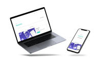
Project progression
Here you can compare the plan to the end result. The template is used for several projects, but the one illustrated here is Maker Club.
Evaluation
What went well?
I managed to meet my objective and get the site successfully up and running by my deadline. I think this project was a good decision, as I'm happy with this solution for showcasing my work, and I'm excited to continue learning more about Bootstrap and CSS. I believe a UX designer should know something about web development, and now I have a much better understanding of procedures, possibilities, realities and time constraints in the development world!
Results update!
Within 11 weeks of launch, I had two firm job offers in the bag, and I accepted one of those. Therefore, the portfolio site served it's initial purpose and I will continue to update it.
Next steps: maintain and update
This is just the beginning of a work in progress and more case studies need to be added. I had issues speeding up the site, and I'm working my way through a number of fixes that should make improvements. Now that I have built up some confidence with the code, I can start to experiment and try new designs or add new features.
Design credits
I created all the icons and imagery on this page, except the top graphic from www.freepik.com by GraphiqaStock.
More projects
Check out more projects!
-
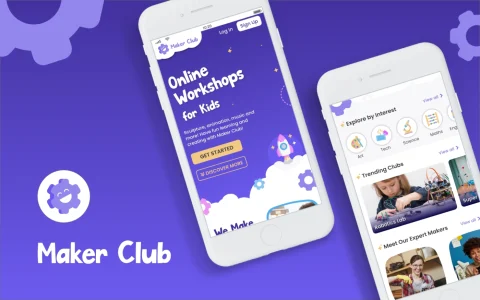
Maker Club
A web app for booking and joining children's online workshops.
-
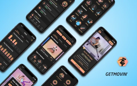
GETMOVIN'
A responsive web app for scheduling and following home workouts.
-

Usability Calculator
A time-saving tool designed to calculate SUS, the industry's go-to standard.